The Challenge: Quantifying Global Safety
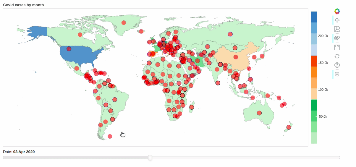
During the height of the pandemic, travel was chaotic. Our client needed a way to objectively assess the "Travel Readiness" of 184 countries in real-time.
This wasn't just about counting cases. We had to ingest and normalize data across 16 distinct policy dimensions, ranging from "School Closings" and "Contact Tracing" to "International Travel Controls" and "Daily Fatalities."
Data Ingestion: Taming 10 Million Rows
The raw data was fragmented. We were dealing with:
- 100+ Static Excel Sheets containing demographic and historical data.
- Live API Feeds from Oxford University (updating every 3 days).
- Daily CSV Dumps from the Johns Hopkins GitHub repository.
In total, the pipeline had to process over 10 million rows of data constantly. Manual updates were impossible.
The Engineering: Automating the ETL Pipeline
We built a fully automated Extract-Transform-Load (ETL) pipeline using Python and Cron jobs.
Daily Automation: A Python script triggers automatically every 24 hours. It pulls the latest CSV from the Johns Hopkins GitHub, parses the raw text, cleans the data anomalies, and pushes updates to our central SQL database.
Multi-Source Sync: A secondary pipeline runs every 3 days to sync with the Oxford University APIs, ensuring our policy data (like "Workplace Closing Policy") stays current with government announcements.
The Algorithm: Scoring Complexity
Raw data isn't insight. We developed a proprietary scoring engine that normalized these diverse inputs into a single metric: the Global Travel Readiness Index (GTRI).
The engine calculated a weighted score from 0 to 5 for each of the 16 policy categories. These weighted scores were then aggregated to produce a final "Readiness" rating for every country.
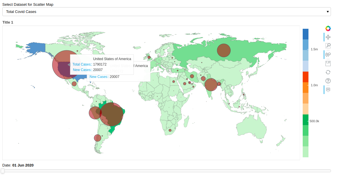
The Output: High-Performance Visualization
The processed data was stored in a high-performance MySQL database, optimized for read-heavy operations. This backend powered a responsive web dashboard that allowed users to visualize the spread, filter by policy stringency, and make data-driven travel decisions in real-time.